23 Oct Examining World Series team logos and their origin
Examining World Series team logos and their origin
Logo design in the World Series
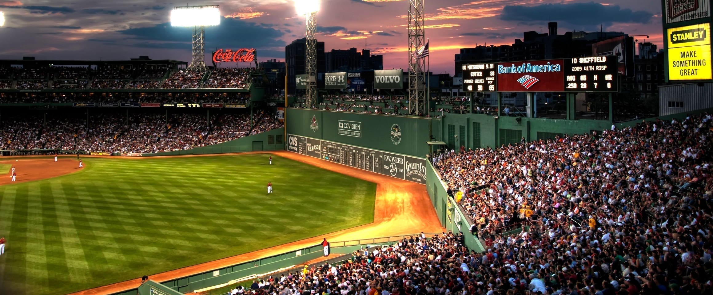
The World Series begins tonight between two of the most historic professional baseball franchises in Major League Baseball – the Boston Red Sox and the Los Angeles Dodgers. As an advertising and marketing agency, we take special note of logos, especially sports logos.
Logos in sports have an emotional appeal and special connection to fans and are influential in their identity and personality. In Tennessee, fans are proud to wear the “Power T” and the Tennessee Titans flame logo with pride. In the same way, sports logos have went through an evolution with some teams while others have remained traditional over time. This is the case with teams like the current Word Series contenders.
The Boston Red Sox
One of Baseball’s most storied franchises, the Boston Red Sox were named the Red Sox by their owner in 1907. Previously, they had been called the Pilgrims or simply the Red Stockings for the red sox they wore with their uniform. Among many, historic Red Sox players include Ted Williams, Carl Yastrzemski, and David Ortiz.
The Boston Red Sox have two versions of their iconic logo, stretching back all the way to 1931. The hanging red sox in their primary logo has only been slightly modified since its inception and shows a literal pair of red sox. This harkening back to the early days of their uniform colors plays well with their name.
Their secondary mark is a form of a scripted “B” adorned on the front of their baseball caps, with a similar font used to spell either Boston or Red Sox on the front of their uniforms. As a result, their logo is one of the most iconic in all of professional sports.
The Los Angeles Dodgers
The Los Angeles Dodgers have a storied history as well. Harkening back from their days in Brooklyn, NY, their name originates from the Trolley Dodgers at the turn of the 20th century when new electric trolleys became faster than horse drawn trolleys. This was quickly shortened to the Brooklyn Dodgers. Historic Dodgers players include Jackie Robinson, Sandy Koufax and Kirk Gibson.
Their primary logo shows a scripted Dodgers in blue with a red baseball showing movement up into the air after a home run hit. While lesser known than their monogram secondary logo, this logo shows action and movement and excitement.
Their secondary mark was adopted after their move from Brooklyn to Los Angeles in 1957. The original version of this mark was a script “B” similar to the Red Sox secondary mark today. However, with a new city, the monogram “LA” was added to the front of their baseball caps to give local fans a new allegiance to the LA Dodgers.
We believe a good logo creates brand awareness for businesses of all sizes. If your company is in search of a dynamic logo or creative inspiration, contact Adams + Swann today.
