05 Apr Taking a look back at the new Titans jerseys
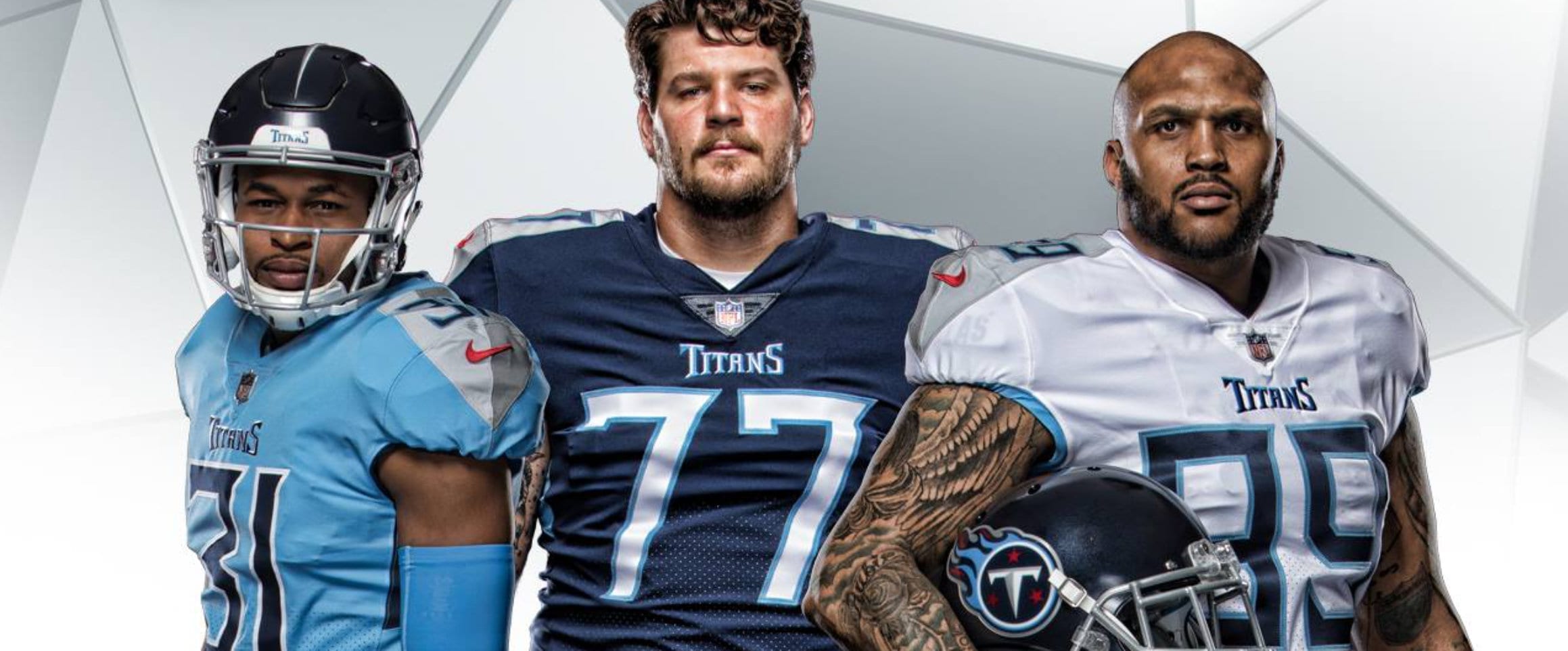
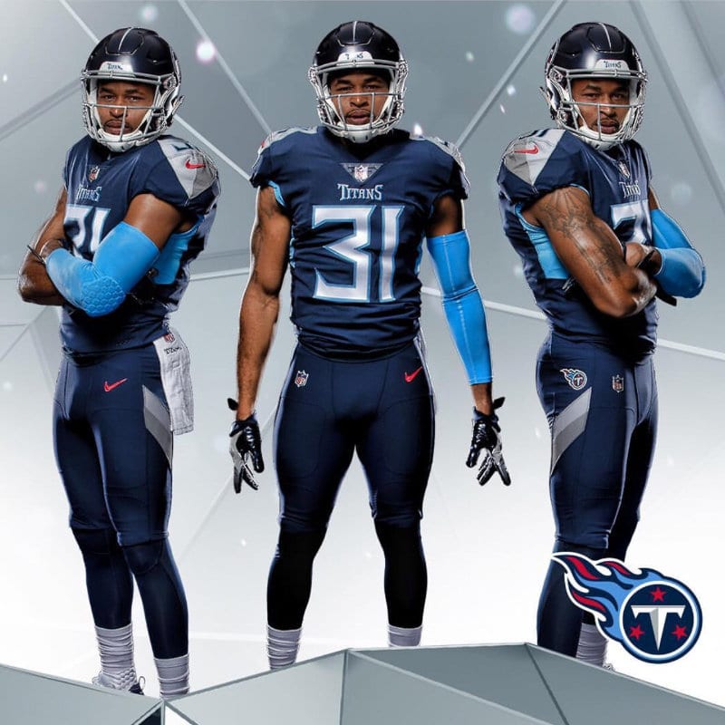
Tennessee Titans unveiled new uniform design during celebration on Broadway
Taking a step back to look at events or work after a given period of time is always a good idea. Whether it is a second look at a new logo or design project or simply stepping away from copywriting – giving an idea space to breath is a big part of the creative process.
The same is true with a NFL team’s uniform design, as witnessed this week with the unveiling of the new Tennessee Titans football uniforms. If you’re a true Titans fan like most of us at Adams + Swann, then you take pride in your team and your state. So while our initial reaction may have been indifferent to start, we are now excited about the creative direction 24 hours later.
The week began with leaked versions of the new Titans jerseys surfacing around the Internet, causing much speculation among fans and paired with a mixed bag of opinions on the design. While initial reactions are good indicators of the pros and cons of a product, examining the finished product is key as you can always see its end use and how it will function within the overall landscape.
At the time of the unveiling, the organization discussed the story behind the new Titans uniforms and the changes in a news release.
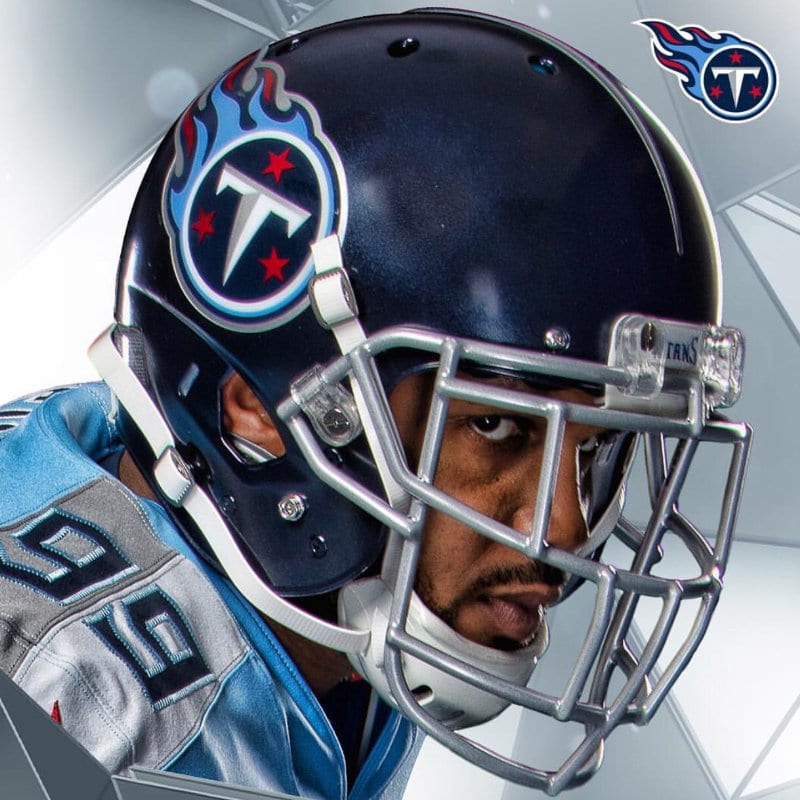
First, they added versatility in their style as they debuted three primary color combinations with navy blue, white and Titans blue. In addition, the navy helmet was a big switch visually as the white helmet has been commonplace since the team’s early days in Nashville.
The uniforms are adorned with unique details such as a sword design on the helmet and pops of red in various places as an accent color.
There was also much talk about the number design also, but the Titans explained their reasoning for the number fonts being dramatically different. They indicated the custom, angular number fonts were designed with Greek or Roman lettering in mind, and that each number on a jersey is shaped in a way that exemplifies the Northeast corner of Tennessee as the state appears on a map, which is a subtle ode to fans in the state.

So what did the Titans actually do?
Sure, the short answer is they updated their look and style with new jerseys, but from a marketing perspective, they did a few other things as well.
Like a good logo or any other creative project, staying fresh and relevant is always good. And that’s exactly what the Titans did. They kept the conversation going during the offseason. Relevancy is key, especially in the NFL where a team can be up and down from year-to-year. New uniforms can energize a fan base and players as well. If you look good, then you feel good, and that can be contagious.
Over the past few years, the Titans identity and visual presence across all of their marketing and social media platforms took a big step forward. Not only did they post back-to-back winning seasons and a playoff win, their Facebook and Instagram accounts and overall communication to their fan base strengthened.
From an advertising and marketing perspective, evolution of your brand is key if you want to stay relevant and fresh in an ever-changing marketplace. Like the Titans, design is one aspect among many integral parts such as company culture and other intangible factors.
If you’re interested in taking your business to the next level, contact Adams + Swann to discuss ways to help you grow revenue through advertising and marketing practices.


